ABOUT US
Introducing DN AUTOMOTIVE, a Korean company in the world.

-
ABOUT US
-
CI

CI
Here are the elements symbolizing all the activities of DN Group.
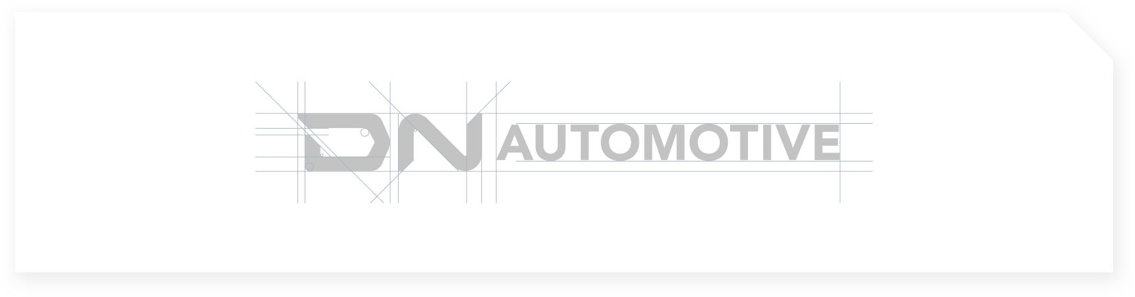
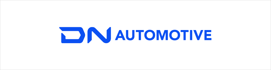
LOGO
The name of the company is the combination of a logo and letters which were created to indicate DN AUTOMOTIVE.
Proportion, spacing and size cannot be changed arbitrarily, and the original forms included in the usage guidelines shall be used.
To secure visibility and maintain aesthetic quality, the logo shall not be used with complicated text or graphic elements,
and the minimum space and size regulations presented in this section shall be complied with.


BRAND STORY
-

The D of DN Group is engraved with DNA of the encounter between DTR AUTOMOTIVE, which started with DONG-AH, and Doosan Machine Tools, which went through DAEWOO and DOOSAN.
-

This is the will to open a new path through constant challenges based on a strong presence.
We will move forward to a bigger future(NEW) by realizing in finite synergy in the future by starting with a strong integration as one(NOW).
BRAND ASSET
BRAND PRIMARY COLOR
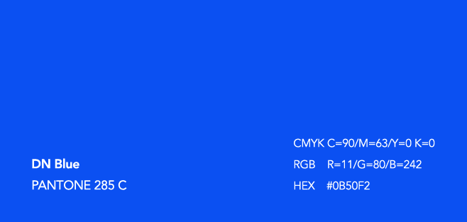
DN Blue is the color embedding the unique value of the company,
our future direction towards better future with our customers, dignity leading the era,
and clarity and reliability of the solutions for our customers
as well as our confidence and passion as one of the global top tier.
GRAPHIC MOTIF
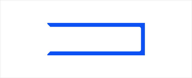
The motif of DN AUTOMOTIVE graphic is a type of frame which was evolved from the DN logo.
And it is a metaphor used as a standard for efficient communication of
various elements including brand colors, symbols and slogans.